

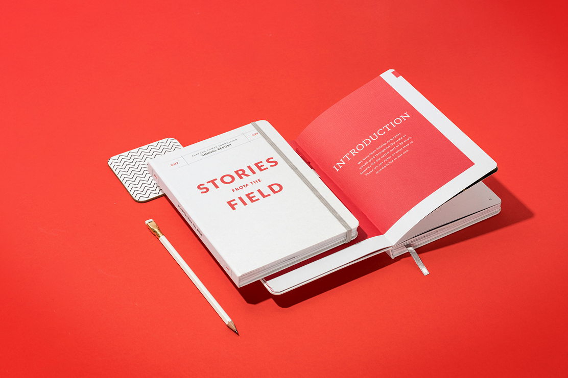
Custom journal interiors determine how information is organised, how writing feels on the page, and how printed content appears to the user. Interior design encompasses page layout, paper type and weight, and the print process used to transfer ink to paper. Understanding each of these elements helps you make informed decisions that align with your project goals and production needs.

Layouts: Structure and Functionality
Page layout refers to the organisation of content across spreads.
Bookblock also provides stock book blocks in standard weights and formats, including 5 mm dot grids and 6–7 mm ruled options, available in popular sizes such as A5 with pre-configured internal layouts.
Custom layouts can include bespoke elements such as section headers, instructional content, trackers or graphics tailored to your brand or project purpose. Clear, consistent grids and alignment improve readability and user engagement by structuring how content is approached on each spread.
Layouts vary according to use case:
- Ruled lines for traditional note-taking
- Dot grid for sketching, planning or flexible use
- Grid/squared for technical work
- Planners and diaries with dated or structured spreads

Paper Types and Weights
Paper choice affects tactile feel, writing performance, durability, and how ink appears on the page. Paper is measured in GSM (grams per square metre); higher GSM values indicate thicker, heavier sheets. As standard Bookblock offers a variety of paper types including standard white, standard ivory and premium options of both colours. We also offer recycled and specially sourced papers, all of which can be reviewed with your account manager to ensure the correct paper is selected for your project.
Core considerations include:
- Standard papers (80–90 gsm) provide a balance of flexibility and strength for everyday use.
- Heavier weights (110–120 gsm and above) reduce show-through and improve performance with wetter inks such as fountain pens.
- Ivory or natural tones for a softer visual effect, often preferred for extensive writing projects.
- Recycled and specialty papers for environmental positioning or specific functional attributes.
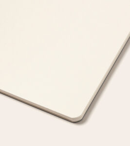
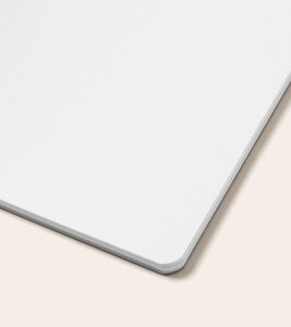
The paper surface influences writing feel and print quality. Uncoated papers absorb ink into fibres, providing tactile resistance and solid line clarity. Some stock papers balance smoothness with ink handling for diverse writing tools.
Sample books are available so paper characteristics can be reviewed prior to production.

Print Techniques: Colour, Finish and Output
Printing transfers your designed content onto selected paper stocks. The choice of print technique affects visual clarity, cost, and how colour is reproduced across page spreads, this affects the overall production price, quality and final output.

Black & White Printing
Black & white printing uses only black ink. It provides strong text contrast and clear linework across internal pages. This technique supports charts, diagrams and greyscale imagery with consistent reproduction and definition.

Single Colour Printing
Single colour printing uses one dedicated ink, often defined in CMYK or a specific spot Pantone. This method allows organised colour application across headings, graphic elements and structural components, with variation achieved through tint levels of the same ink.
Artwork can be prepared by using one colour swatch from the outset, usually a CMYK value or Pantone. When using a Pantone swatch, the file must reference the selected ink consistently to maintain colour integrity throughout the interior.

Two Colour Printing
Two colour printing applies two separate inks, creating visual distinction between content types. Designers use a secondary colour to emphasise key elements such as headings, section markers or callouts, aligning printed content with brand colours or visual hierarchies. In both single and double colour printing, you’re able to utilise the selected colour swatch in a variety of opacity density to create more depth to your design.

Full Colour Printing
Full colour printing uses CMYK process inks across the entire page block. This technique supports vivid graphics, detailed imagery and photographic content, with precise colour blends and gradients. Offset printing is used for high quality and consistent results over larger runs.
Surface and Finish: Matte vs Gloss Effects


Paper surface and print finish determine how ink interacts with the page. Matte papers absorb ink into the surface, producing a subdued sheen that supports legibility under varied lighting and encourages natural writing feel. Gloss finishes reflect light and enhance the appearance of printed colour, supporting high-impact visual content such as vibrant illustrations or iconic photography.
Choice of finish also influences tactile perception. Matte surfaces reduce glare and provide a text-focused experience. Gloss surfaces lend brightness and enhanced colour saturation.

Preparing Files for Print
Printing accurately depends on well-prepared files that include bleed and safe margins to account for trimming and binding. Artwork should be created at correct dimensions, in the appropriate colour format (CMYK for full colour, defined swatches for single or two colour), and exported as high-resolution files ready for press.
Pagination is also a key element to consider when printing custom printed inside pages, with spreads positioned in reading order for correct assembly. Understanding pagination avoids errors in press output and ensures continuity across page turns.

Conclusion
Custom journal interiors combine structured layouts, paper choices, and print techniques to deliver functional, durable and visually engaging notebooks. Layout planning and pagination establish the sequence of content. Paper type and weight determine writing performance and ink behaviour. Print techniques from black & white through full colour define how content appears on the page. Surface finish influences visual impact and user interaction.
By aligning layout decisions with appropriate materials and printing methods, you shape the interior experience and output quality. These elements come together in production-ready files that translate design into tangible journals with clarity and precision.