

Two Colour Printing
Printing in two colours can have several advantages compared to full colour print, including cost efficiency, a sleek and minimal aesthetic, and a simpler file setup. In two colour printing, the printer uses only two CMYK or Pantone swatches to create text, images, or graphics.
Using two colours can enhance a design’s visual impact while maintaining simplicity and elegance. A second colour helps emphasise key elements such as headings, important notes, or calls to action. This printing option is ideal for many brands, as it aligns with the primary colours in their logos or marketing materials.
To print in two colours your file needs to be printed in either two C, M, Y or K colours or Pantone colours. The file must be designed using the two colour swatches and cannot be converted to meet requirements at a later stage.
Design your file in two CMYK colours
When designing your notebook file it’s much easier to design the file in two colours from the get go. To ensure you’re using the correct colour swatches, the first step would be to create the two CMYK swatches that you will use.
Click on a design element you want to add colour to, this could be a shape or text. Then in the properties panel click on ‘fill’ and select the second window named ‘colour’.
In this window you can add in CMYK values if you have an exact colour in mind, alternatively you can use the sliders to create the exact colour you want.
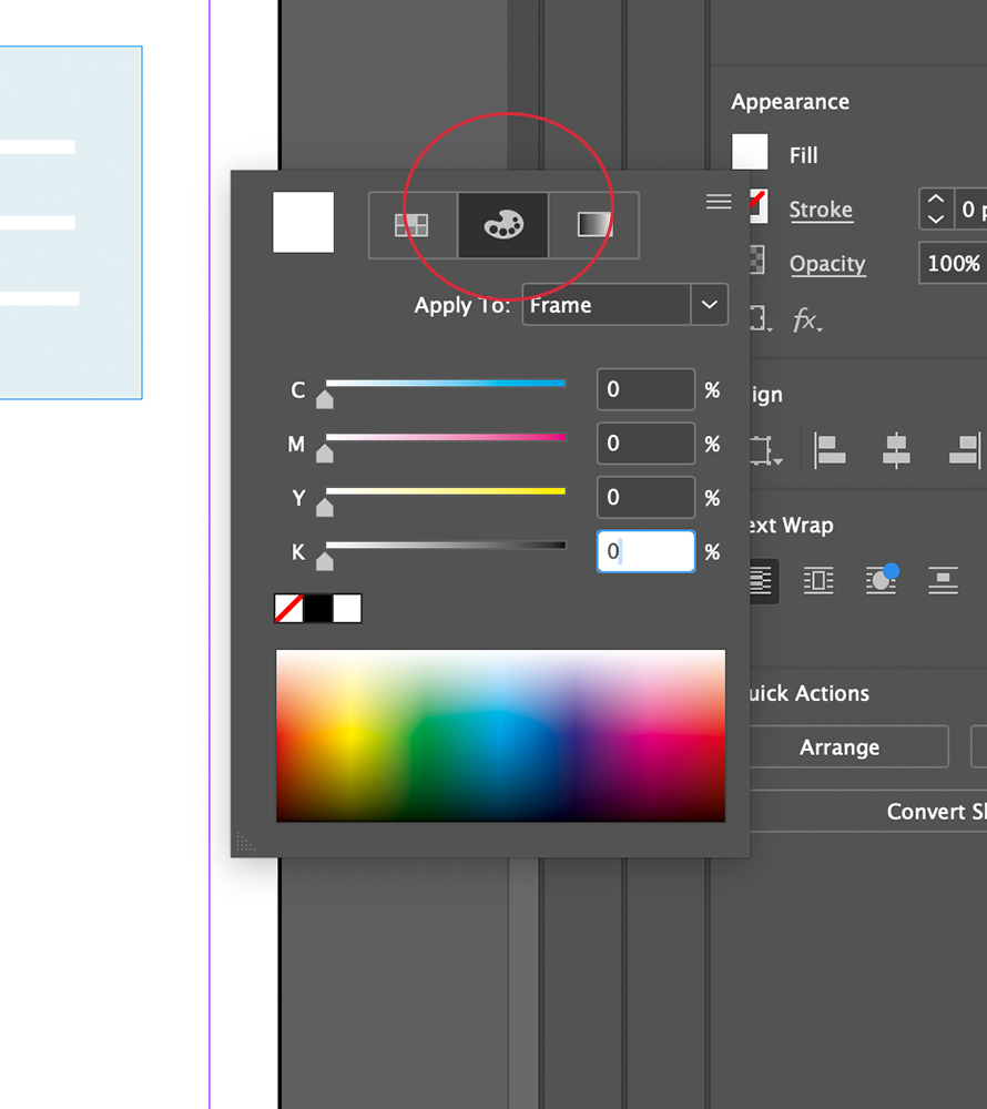
Click the CMYK colour panel and type the CMYK values
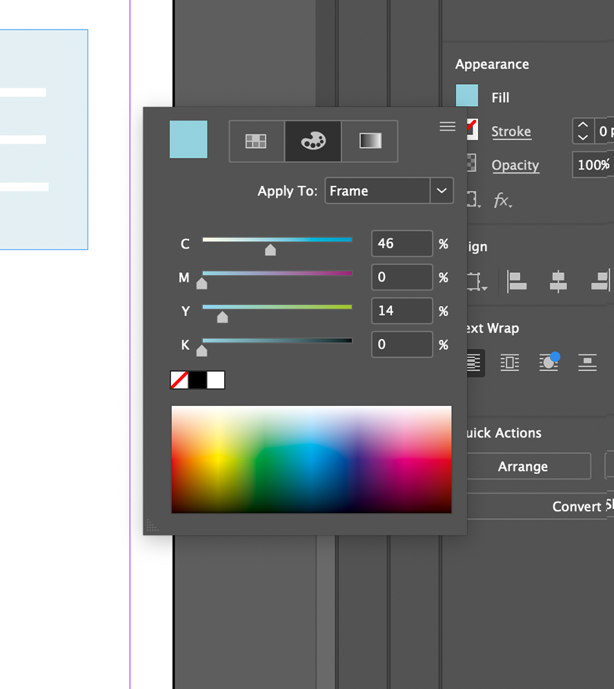
Use sliders to create the colour of your choice
Once you have created your CMYK colour, click back into the first ‘Swatches’ window and navigate to the bottom to click the ‘+’ symbol. By pressing the + symbol, it will automatically add your new swatch to your document so you can easily access the swatch throughout your document.
Once you have completed these steps for your first colour, repeat the steps for a second colour unless you wish to use a basic colour like ‘black’ which already exists as part of your swatch palette.
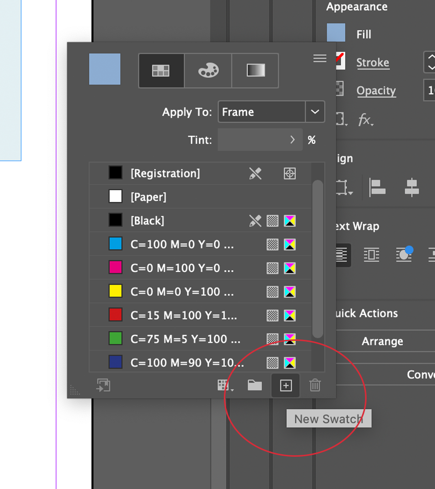
Add new colour swatch
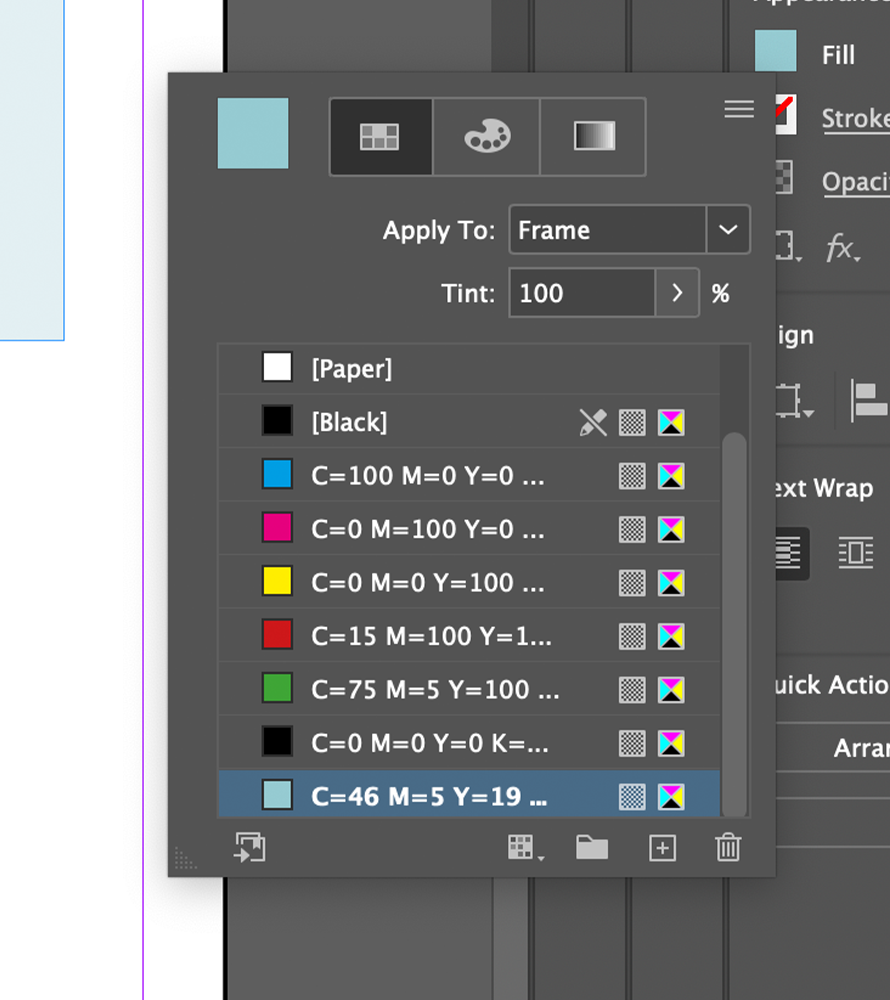
Your swatch has now been added
To make your designs more dimensional you can use your CMYK swatches at different densities to create lighter and darker shades. To do this, you simply need to apply the swatch to a chosen element and adjust the percentage of ‘tint’ within the swatches.
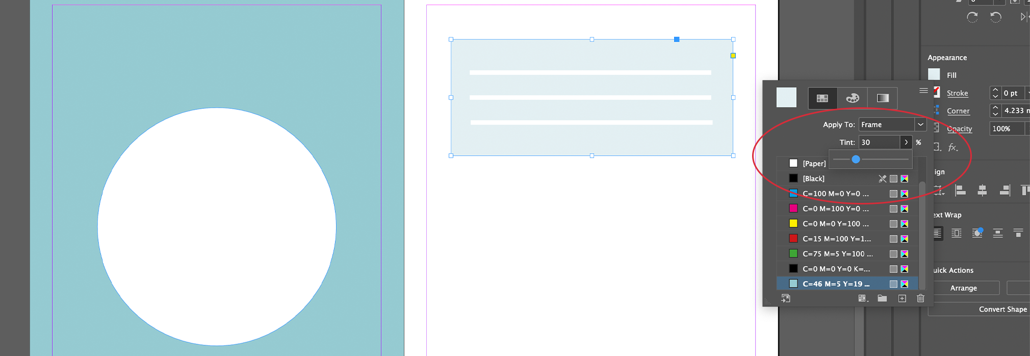
Use slider to change the tint value
Do’s: Ensure all text elements are ‘filled’ with your single swatch colour.
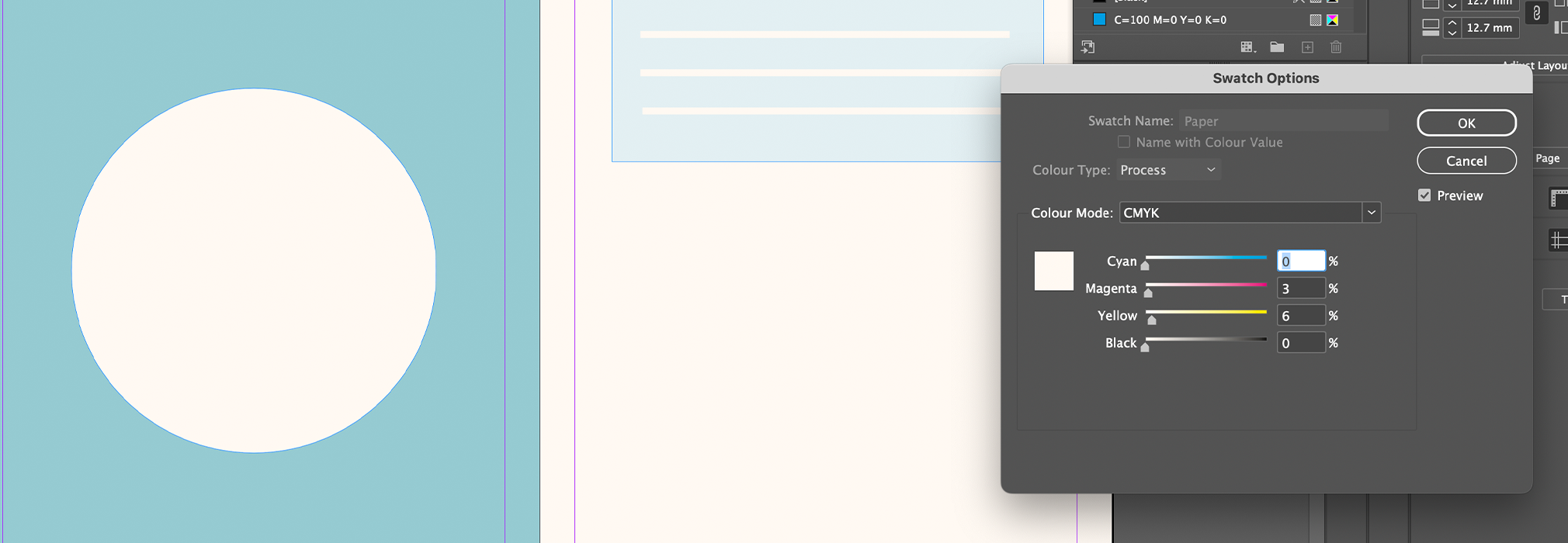
Use ‘paper’ swatch to create white shapes which will act as negative spaces. When printing, the printer will only print the blue colours and so the ‘white’ elements will just show the paper colour underneath.
Please note the white elements will not be as brilliant as shown in preview if you’re printing on Ivory paper. For a more accurate preview, you can double click the ‘paper’ swatch and adjust the colour (5% yellow + 3% Magenta) to preview your design on ivory paper.

Use slider to change the tint value
Dont’s: Do not use any more than two CMYK colours within your document, this will automatically make it a multi colour file and will no longer be suitable for two colour printing.
Once your design is complete, simply save and submit.
Design your file in two Pantone colours
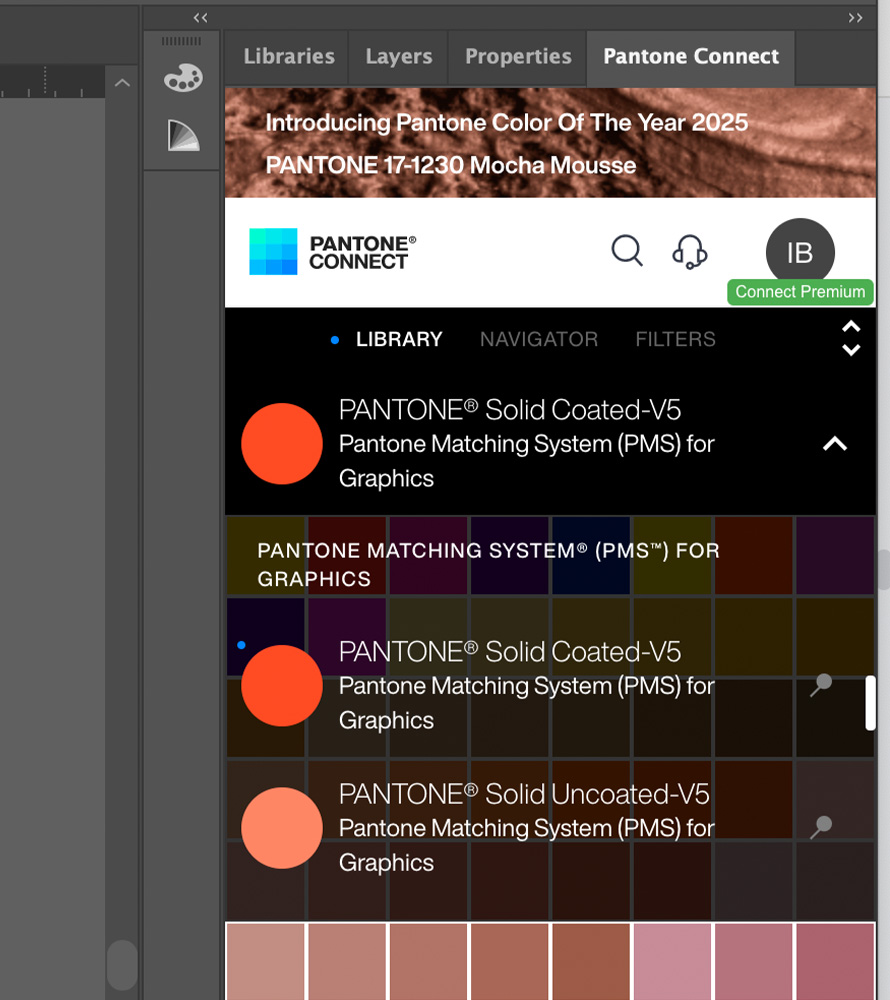
If you are featuring a pantone colour within your design then you need to embed the pantones within the file using the Pantone Connect extension. To embed your file simply:
- Open the Pantone Connect extension and select either the Solid Coated V5 or Uncoated V5 colourbooks.
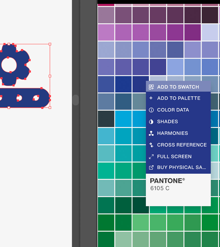
- Select the shape or text you wish to fill with colour
- Select a pantone colour inside the Pantone Connect panel
- Click the three dots shown within the pantone swatch and select ‘Add to Swatch’
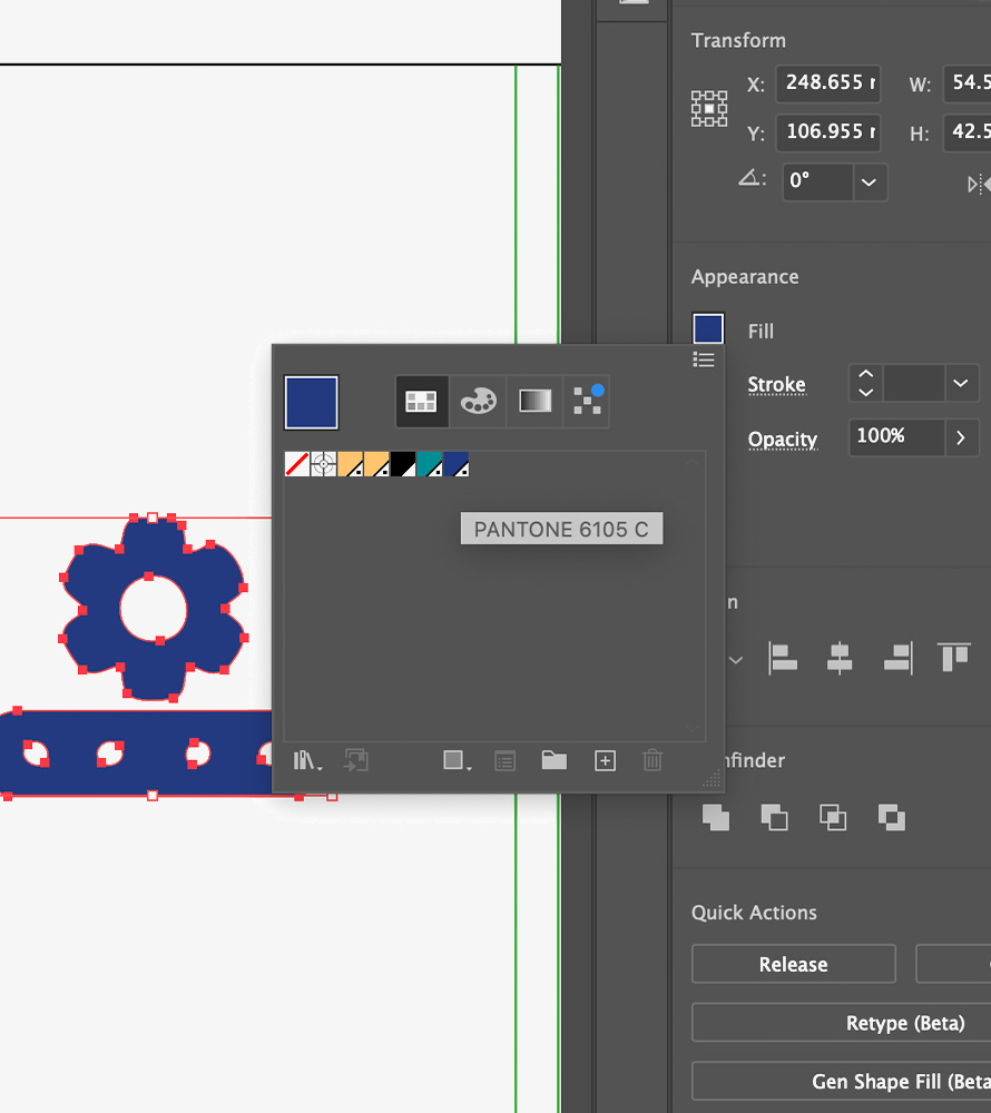
If you then click into the properties panel and double click the FILL section you will see all of the embedded pantones.
Open pantone connect extension
Add selected pantone colour to swatch
Find your selected pantone in swatchbook
Once you have completed these steps for your first colour, repeat the steps for a second colour unless you wish to use a basic colour like ‘black’ which already exists as part of your swatch palette.
To make your designs more dimensional you can use your CMYK swatches at different densities to create lighter and darker shades. To do this, you simply need to apply the swatch to a chosen element and adjust the percentage of ‘tint’ within the swatches.
Adjust colour opacity to give your file more depth
Do’s: Use ‘paper’ swatch to create white shapes which will act as negative spaces. When printing, the printer will only print the embedded swatch colours and so the ‘white/paper’ elements will just show the paper colour underneath.
Dont’s: Do not use any more than two Pantone colours within your document, this will automatically make it a multi colour file and will no longer be suitable for two colour printing.
Please note white elements will not be as brilliant as shown in preview if you’re printing on Ivory paper. For a more accurate preview, you can double click the ‘paper’ swatch and adjust the colour (5% yellow + 3% Magenta) to preview your design on ivory paper.
Adjust page colour to get an accurate preview on ivory paper